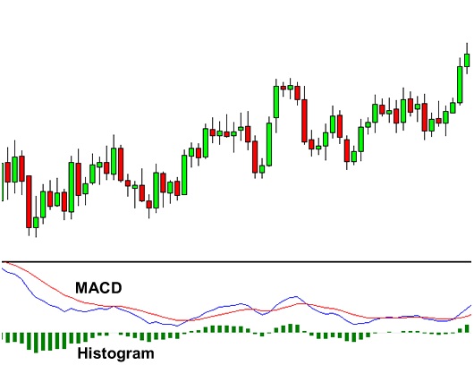
MACD is an acronym for Moving Average Convergence Divergence. This tool is used to identify moving averages
that are indicating a new trend, whether it’s bullish or bearish. After all, our top priority in trading is
being able to find a trend, because that is where the most money is made.
With an MACD chart, you will usually see three numbers that are used for its settings.
The first is the number of periods that is used to calculate the faster moving average.
The second is the number of periods that is used in the slower moving average.
And the third is the number of bars that is used to calculate the moving average of the difference between the faster and slower moving averages.
For example, if you were to see “12, 26, 9” as the MACD parameters (which is usually the default
setting for most charting packages), this is how you would interpret it
The 12 represents the previous 12 bars of the faster moving average.
The 26 represents the previous 26 bars of the slower moving average.
The 9 represents the previous 9 bars of the difference between the two moving averages.
This is plotted by vertical lines called a histogram (the green lines in the chart above).
There is a common misconception when it comes to the lines of the MACD. The two lines that are drawn
are NOT moving averages of the price. Instead, they are the moving averages of the DIFFERENCE between
two moving averages.
In our example above, the faster moving average is the moving average of the difference between the
12 and 26-period moving averages. The slower moving average plots the average of the previous MACD line.
Once again, from our example above, this would be a 9-period moving average.
This means that we are taking the average of the last 9 periods of the faster MACD line and plotting
it as our slower moving average. This smoothness out the original line even more, which gives us
a more accurate line.
The histogram simply plots the difference between the fast and slow moving average.
If you look at our original chart, you can see that, as the two moving averages separate,
the histogram gets bigger.
This is called divergence because the faster moving average is “diverging” or moving away
from the slower moving average.
As the moving averages get closer to each other, the histogram gets smaller. This is called convergence because
the faster moving average is “converging” or getting closer to the slower moving average.
Ok, so now you know what MACD does. Now we’ll show you what MACD can do for YOU.
How to Trade Using MACD ?
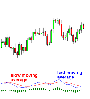
Because there are two moving averages with different “speeds”, the faster one will obviously be quicker to react to price movement than the slower one.
When a new trend occurs, the fast line will react first and eventually cross the slower line. When this “crossover” occurs,
and the fast line starts to “diverge” or move away from the slower line, it often indicates that a new trend has formed.
From the chart above, you can see that the fast line crossed under the slow line and correctly identified a new downtrend.
Notice that when the lines crossed, the histogram temporarily disappears.
This is because the difference between the lines at the time of the cross is 0.
As the downtrend begins and the fast line diverges away from the slow line, the histogram gets bigger,
which is good indication of a strong trend.
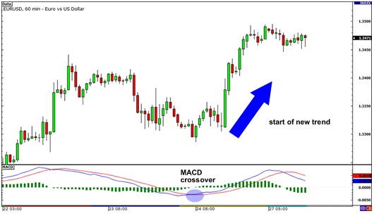
Let’s take a look at an example.
In EUR/USD’s 1-hour chart above, the fast line crossed above the slow line while the histogram disappeared. This suggested that the brief downtrend would eventually reverse.
From then, EUR/USD began shooting up as it started a new uptrend. Imagine if you went long after the crossover, you would’ve gained almost 200 PROFITs!
There is one drawback to MACD. Naturally, moving averages tend to lag behind price. After all, it’s just an average of historical prices.
Since the MACD represents moving averages of other moving averages and is smoothed out by another moving average, you can imagine that there is quite a bit of lag.
However, MACD is still one of the most favored tools by many traders.